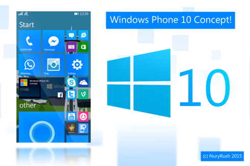
Deviantart user NuryRush created the Windows Phone 10 concept but didn't reveal much. We know it includes a set of transparent tiles, a very large Cortana tile size, and some other beautiful elements.
We get a blue theme here and the tiles are clearly separated from each other. The UI feels cohesive, and obviously it is divided into multiple parts, such as the "Start" screen and other screens. I'm not surprised to see continuously scrolling screens (vertical and horizontal) and mixed tabs, although this can be confusing. It feels like a desktop operating system on a phone ...
One thing that must be changed in Windows Phone 10 is the appearance of the settings. We can no longer have a huge vertical list, nor can we be curious about the settings. The solution would be a tabbed system, or perhaps a more compact setup category and sub-category.
